Feb 26, 2022

My Bird Neighbors


Since last November, we have had bird neighbors visiting our apartment everyday. When my husband first bought bird food, we were looking forward to seeing birds. But we had waited for a month for the first bird to come. Now, they come visit everyday: at least three meals (breakfast, lunch and dinner) and numerous snack visit.

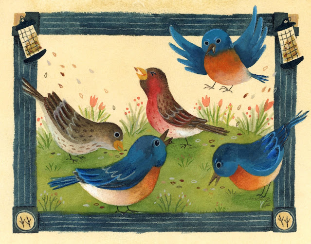
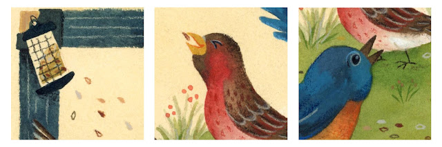
There are two kinds of birds visiting our place. One is house finches. They are three couples (brown head and red head). The other is eastern bluebirds. The feathers of eastern bluebirds are very beautiful, and they have a cubby orange chest. 

When birds come, our cats would make a very interesting sound to welcome them. My husband said they are trying to mimic the sound which birds are making. When we hear it, we know birds are here!

These birds bring much fun to our life. Watching them eating make us so relaxed. So I want to create an illustration about them!


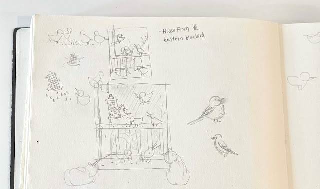
The initial idea was to draw birds eating at the our apartment's balcony, as you can see from the sketch. But somehow, I feel it's not quite right. The sketch did show what I see, but I don't see the liveliness. I don't want the illustration to be too literal, but the theme must still be birds-eating and also include balcony elements. 

So, it needs transformation. I thought of the illustrator Rebecca Green. One of the illustrations she designed for her Patreon shows an antique look. I like it very much: yellowish background and sketch-like green frame. I took reference from her pictures and decided my illustration of birds would have an antique look, and the balcony elements would be transformed into a frame. 


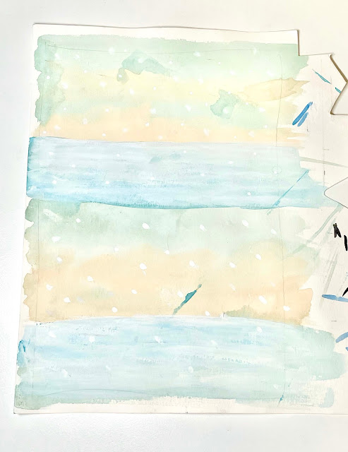
Then the coloring part. First, I used gouache to paint a dull yellow as an undertone. Then, I colored the birds, frame, grass...But at this point, I only painted a thin layer. I wanted to get a certain idea how the illustration might look like. If I am not satisfied with one color and want to change to another, because the illustration is painted in a thin layer, I have room for adjustment. 


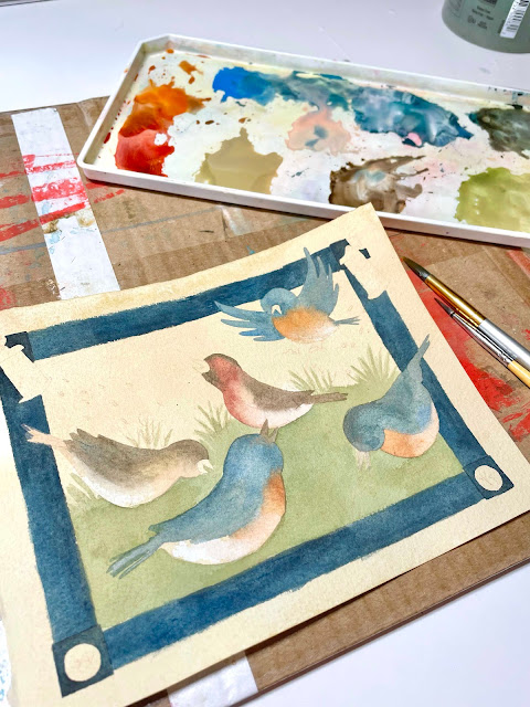
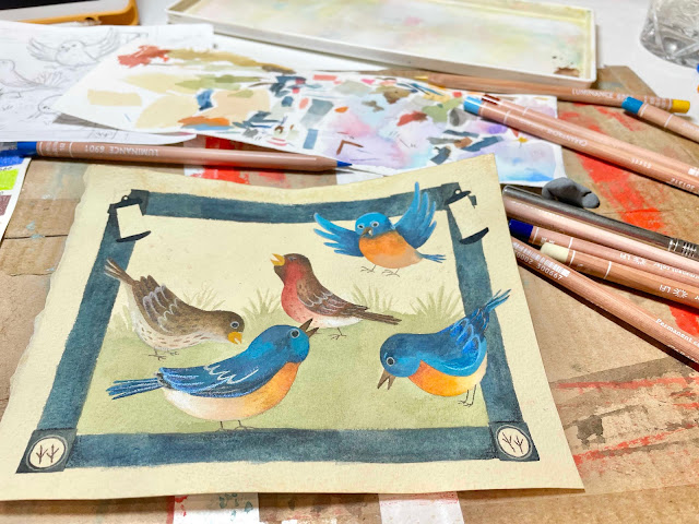
Once I was satisfied with all the colors in the picture, I began adding values to colors, making the colors brighter or darker. And then using colored pencils for the details. 

The style of this illustration is different from my previous work. I like the transformation of the balcony elements. I think I step out a bit from my comfort zone!

***

 【我的小鳥鄰居】

自從petit ami買了鳥飼料後,我們和貓一直很期待小鳥來訪。從安裝好後的每日盼望,足足等了一個月。第一隻鳥來時,我們好開心;現在牠們是常客,每天至少來三次(早午晚餐),和想到就來吃幾口的點心時間。

最常來的是House finch,牠們是三對夫妻(一隻紅頭,一隻棕頭)。偶爾來訪的是Eastern Bluebird,身形比較圓潤,橘色圓滾滾的肚子超可愛,吃相比House Finch豪邁。

有了小鳥鄰居,我們和貓的生活多了很多樂趣。Albert和Richard看到鳥來就會模仿鳥叫的聲音,我和petit ami就知道小鳥來了!

所以,決定用插畫記錄可愛的鳥鄰居。

一開始構圖的想法很直觀——小鳥在陽台吃飼料的樣子:飼料吊掛在陽台側壁,有的小鳥在欄杆上吃,有的在地上吃。但是,看著這個構圖,覺得哪裡怪怪......?我想表現小鳥吃飯的雀躍,又想包含家裡陽台的元素。我想到插畫家Rebecca Green,她為自己Patreon設計的圖融入復古的元素;泛黃底色、富含筆觸的手繪框邊。我喜歡這些元素,想把它融入到自己的圖。最後,決定跳脫框架思考,不是畫眼睛所見,而是變形、變形!

這是變形後的草圖:

顏色以復古色為主題,要有點舊舊的,但又非看起來髒掉的顏色。像是,Bluebird的藍色要很飽滿但不是艷;House finch的主色是棕、紅、米色,而且要和底色的黃有和諧感。

上色時,第一輪完成所有配色,但只刷上淡淡一層。這步驟是幫助自己具體看見畫面呈現的感覺。第二輪開始一層層疊色,讓角色躍然紙上。

第一輪讓我最緊張。不確定腦中的畫面能不能好好實現、執行過程會不會發現畫壞了或方向不對?不過,過了一會發現,沒自己想像的煩,慶幸自己勇敢挑戰。

小鳥身上的細節用色鉛筆完成。下次想讓線條再大膽一些。不過,我很喜歡這次構圖跳脫框架的嘗試。

Thanks for reading!
Jenny☺


Feb 19, 2022

The Fun in Winter


The most wintery illustrations I drew in this year's winter must be these two!

After moving from Texas to Indiana, I am looking forward to seeing snow. Though I don't like cold (I only want to stay under blanket in winter), I still want to experience the beauty and fun in a snowy world. Such feeling is what I want to show in my illustrations: Coldness and Playfulness. Winter is cold but full of fun!

The inspiration came from the iceskating I saw in Chicago (Gouache Practice #2), and Christmas and the fairy tale <Nutcracker>. I want to show the fun in winter by carrying out these idea. 


Initially, I sketched on papers. For the sketch of Santa and elves, I especially like the moose skating aid. I didn't know there is such thing until the trip to Chicago where I discovered penguin skating aids which help kids to skate. (I definitely need it as well since I have limited experience in ice skating.) 


As for the Nutcracker sketch, at first I imagined the girl Clara and the prince Nutcracker skating in front of a castle. However, after drawing the castle, I felt something wrong. I feel the space in the picture is gone. The characters look too close to the castle, which I don't like. But I also don't want to decrease the size of castle so as to create a sense of space. At the end, I decided to eliminate the castle. The focus will be Clara and Nutcracker. 

When planing the color theme, initially I planned it should be holiday colors such as red, yellow and green. But I wanted to challenge myself to create an illustration which features a blue tone. So, I changed the color theme to Turquoise Blue, Green Yellow and Flesh Tint for the Nutcracker illustration. 

In addition, I want the audiences to feel a sense of cold but also warmth in the snowy illustrations. Blue and white represent the cold; warmth comes from the fun of the interaction from the characters. 


After the idea and direction were clear, the rest was patience and persistence to finish the work!

I want to share some of my favorite details:

***

【冬天的童話】

這年冬天,畫得最有感的就是這兩張圖吧!

從德州搬來印州,我很期待在北方看到雪。雖然怕冷、冷就不愛動,但還是想親身體驗雪白世界的美與玩樂。這就是這兩張插畫想呈現的感覺:Coldness & Playfulness。好冷但好玩!

創作靈感來融合了我在芝加哥看見的溜冰(Gouache Practice #2),以及聖誕節和冬天的童話故事《胡桃鉗》。我想透過童話般的節日與故事,表現屬於冬天的玩樂。

一開始先在紙上畫草稿。聖誕草圖那張,我最喜歡的是麋鹿溜冰輔助器。哈~我以前不知道有這種東西,直到在芝加哥發現有企鵝款的溜冰輔助器,有些小孩會扶著這溜冰。(我不會溜,應該很需要!)

胡桃鉗的草圖,背景原先是設定女主角Clara和胡桃鉗王子在城堡前溜冰。但畫好城堡後,我覺得離角色太近,空間感沒了。但是也不想把城堡縮小拉出空間感,後來決定捨去城堡,聚焦在角色上。

規劃顏色時,原先設定胡桃鉗和聖誕節插畫的主題色都是紅色,但後來想來點挑戰,把胡桃鉗改成冷藍色調,從土耳其藍、淡綠黃和膚色去變化。

雪景的話,我想表現寒冷但又有溫暖。以藍、膚色和白色帶出雪與寒;暖來自角色互動所帶來的生氣。

等到草圖和色彩都有明確方向後,就是耐心一筆一畫完成啦!這邊就不詳述了,不過想分享幾個我喜歡的細節:

Thanks for reading!
Jenny ☺

Feb 4, 2022

Gouache Practice #3


This week's practice is the interior of a Japanese restaurant and seafood. 

The reference I took is a Japanese restaurant called "Sakura", which is located in Indianapolis. My husband and I had been there twice. The food is great, and the price is decent! We underestimated its popularity as the second time we visited there. We didn't make a reservation and many people were waiting to be seated, so we ended up waiting for an hour. 

Similar to Gouache Practice #2, I illustrated a JP restaurant again. And I plan to work on a new illustration based on this one. For this practice, I simply layered down colors and didn't care much about light/dark. The fun part was adding characters and JP traditional masks. I think they bring liveliness to the pic. 


As for the seafood, I drew some common seafood which is used in JP cuisines. My favorite are the octopus and squids. I love using colored pencils to add texture on them. The red-brownish colors make me feel that I was barbecuing the octopus and squids while illustrating them. I wish I could go to a Taiwanese night market and get BBQ food!


***

 【水彩練習#3】

這次的練習是日本料理餐廳和它的延伸——海鮮。

餐廳是參考Indianapolis的日本料理餐廳「Sakura」。我和petit ami拜訪了兩次,很好吃,價格也很實惠。第二次拜訪低估了它受歡迎程度.沒訂位到現場,結果等了一個小時。

繼上次水彩練習#2,我又練習了一次日料餐廳內裝(之後要從這張延伸畫一張完整的圖)。這次畫法是一層層疊色,沒特別強調明暗面。比較好玩是畫了老闆和日式面具。加了角色,果然圖畫多了生氣,我就喜歡這種!

海鮮練習呢,我列了一些日料常見的食材。過程中好玩的地方是用色鉛筆加筆觸。在畫章魚和魷魚時,上紅棕色筆觸,好像在炭烤牠們。哈哈,畫著畫著很想念台灣夜市燒烤。

Jenny☺